UX/UI Case Study and App Design
PROJECT OVERVIEW
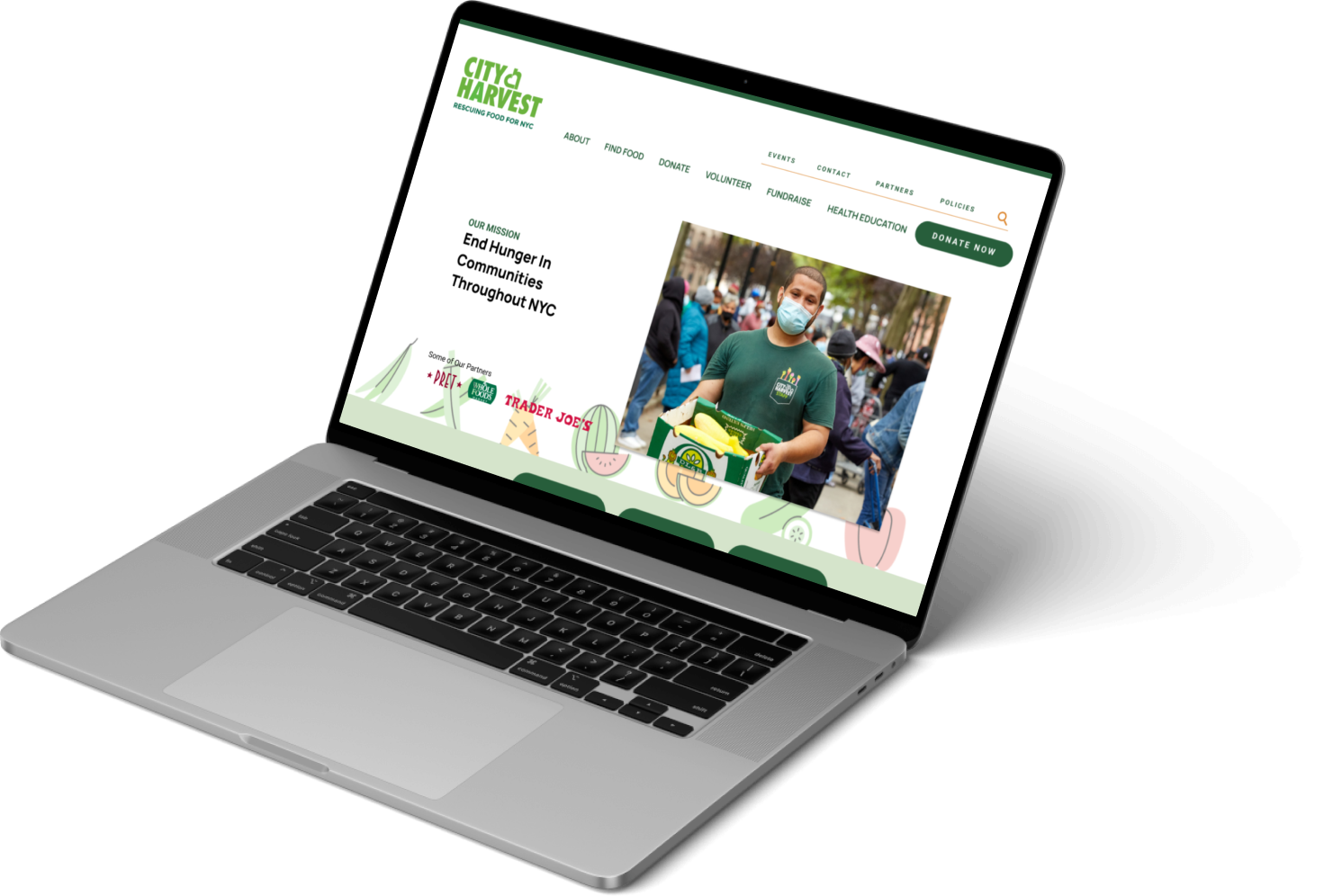
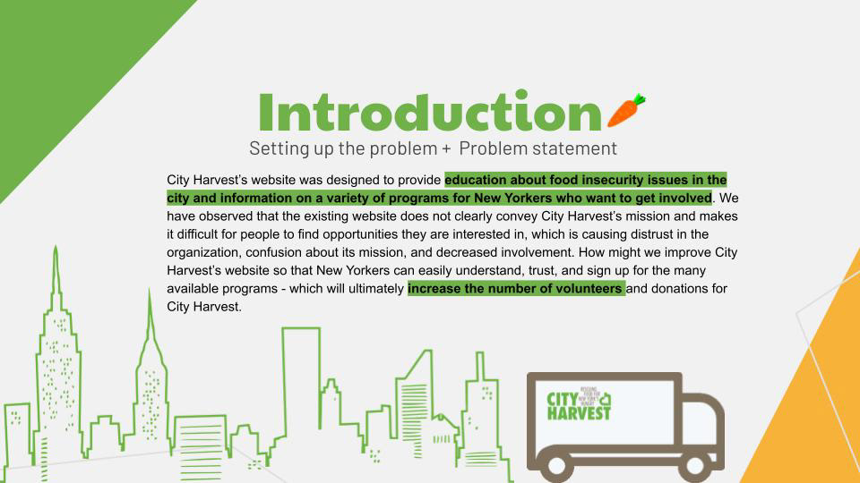
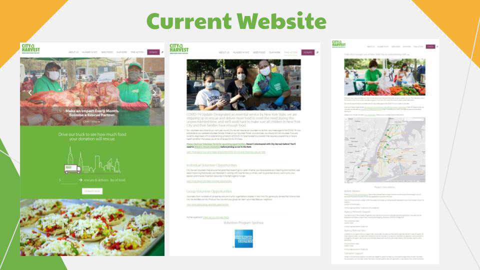
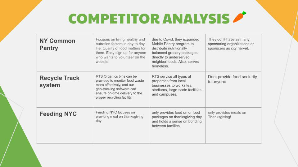
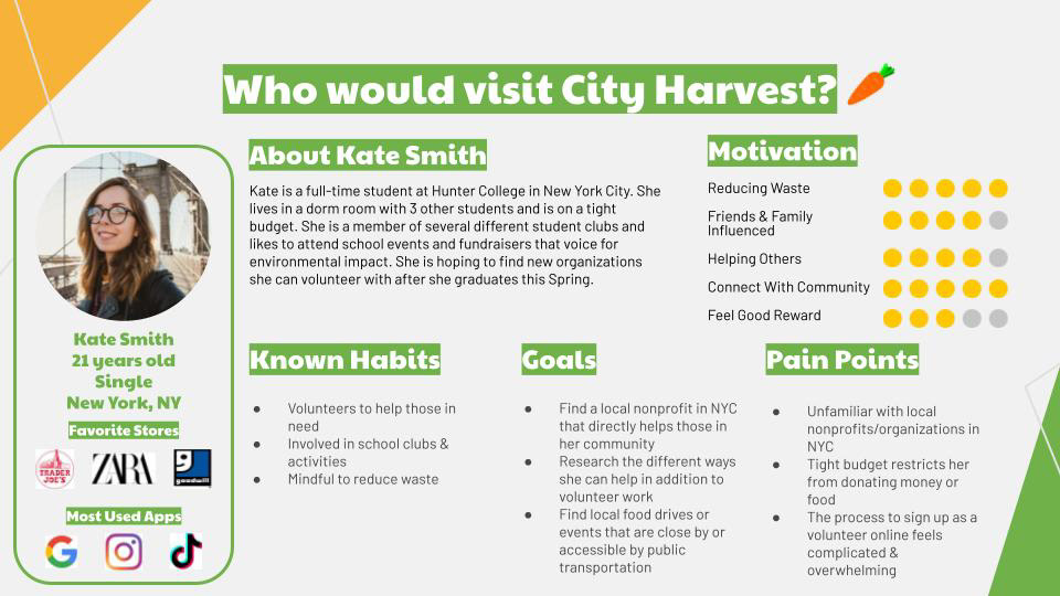
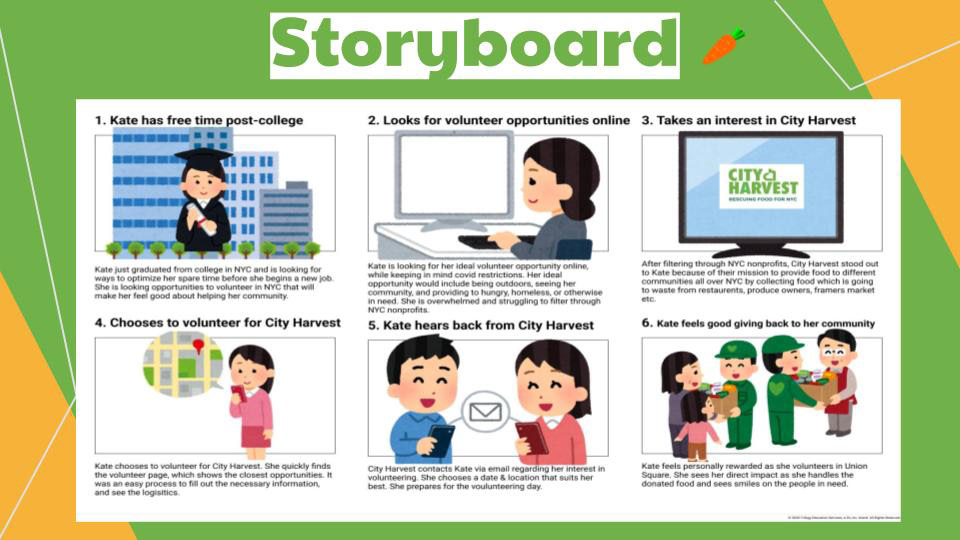
City Harvest’s website was designed to provide education about food insecurity issues in the city and information on a variety of programs for New Yorkers who want to get involved. We have observed that the existing website does not clearly convey City Harvest’s mission and makes it difficult for people to find opportunities they are interested in, which is causing distrust in the organization, confusion about its mission, and decreased involvement. How might we improve City Harvest’s website so that New Yorkers can easily understand, trust, and sign up for the many available programs - which will ultimately increase the number of volunteers and donations for City Harvest.
BACKGROUND
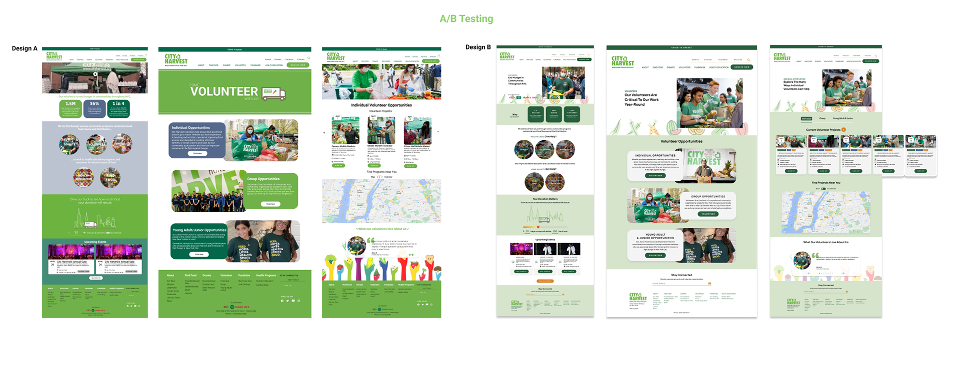
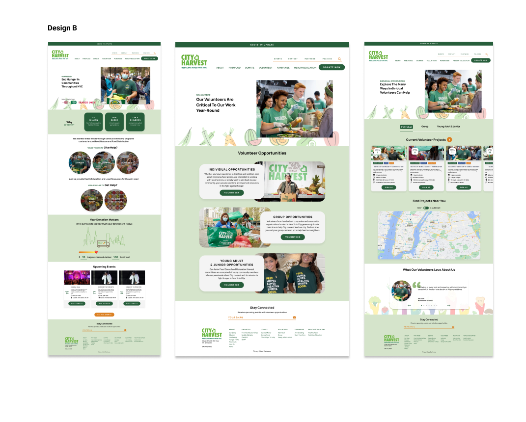
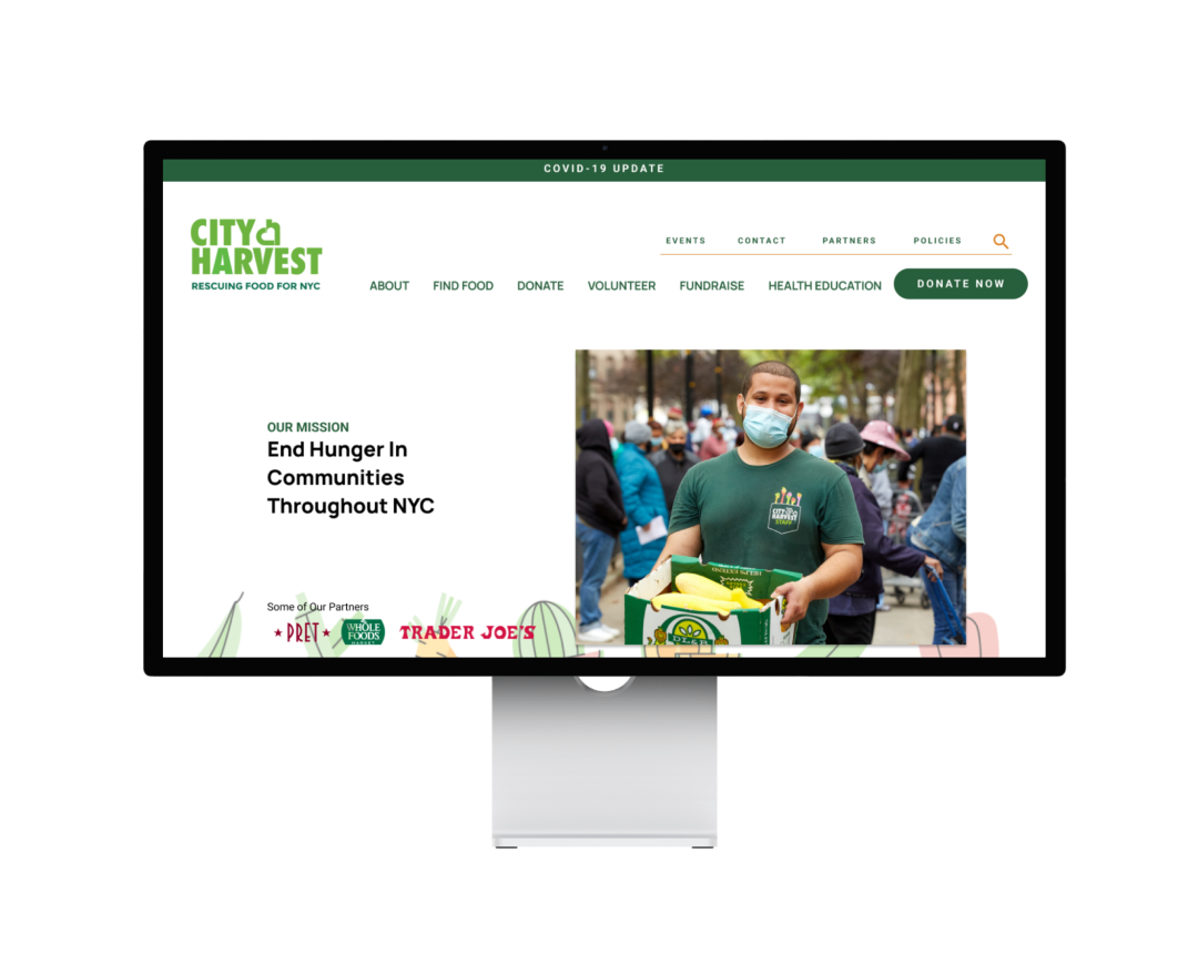
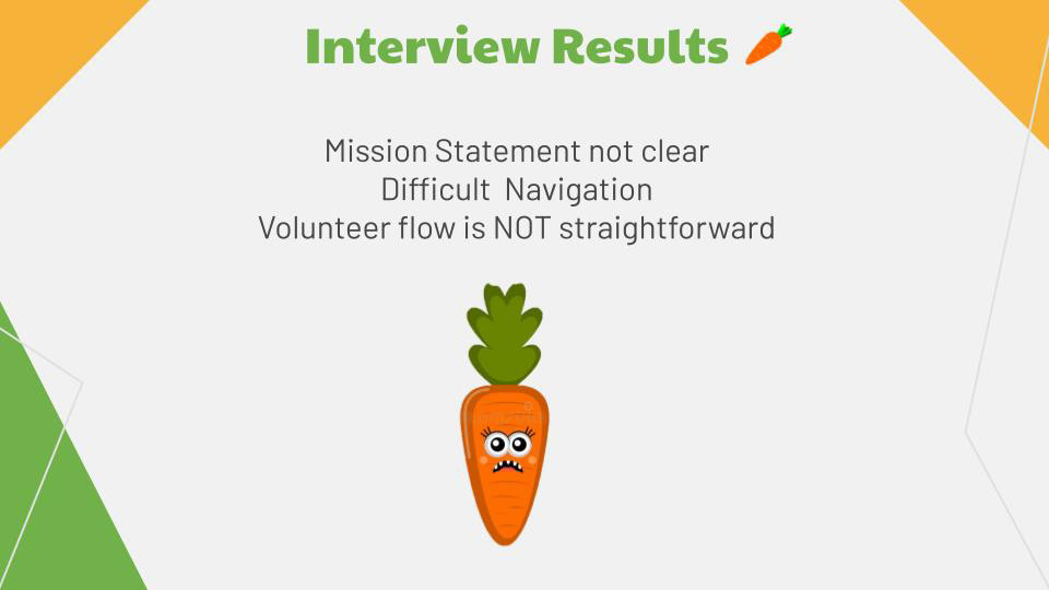
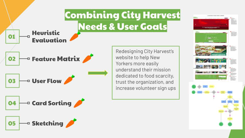
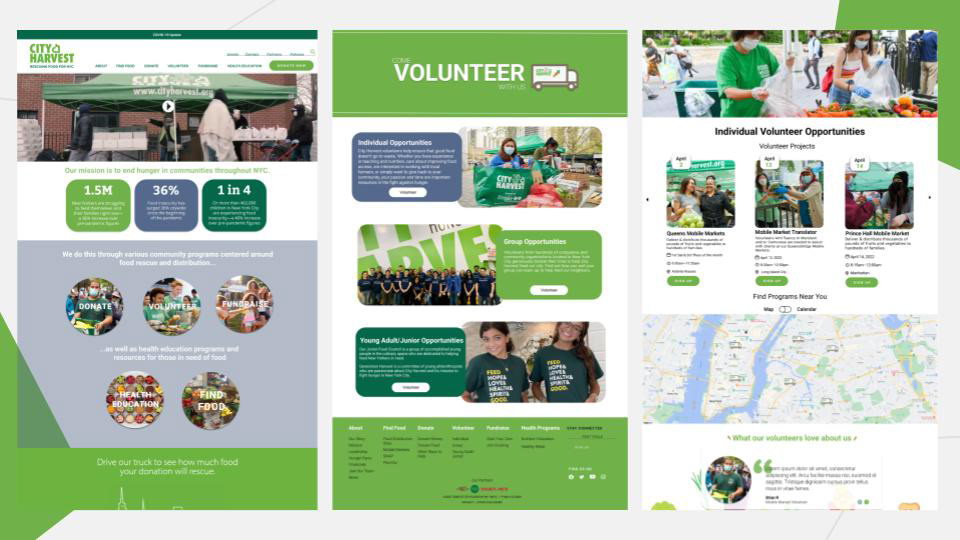
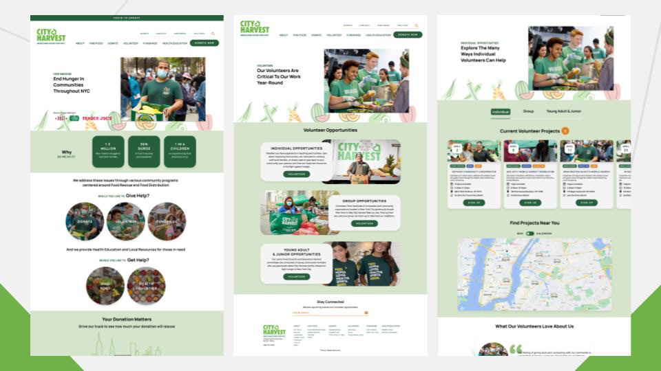
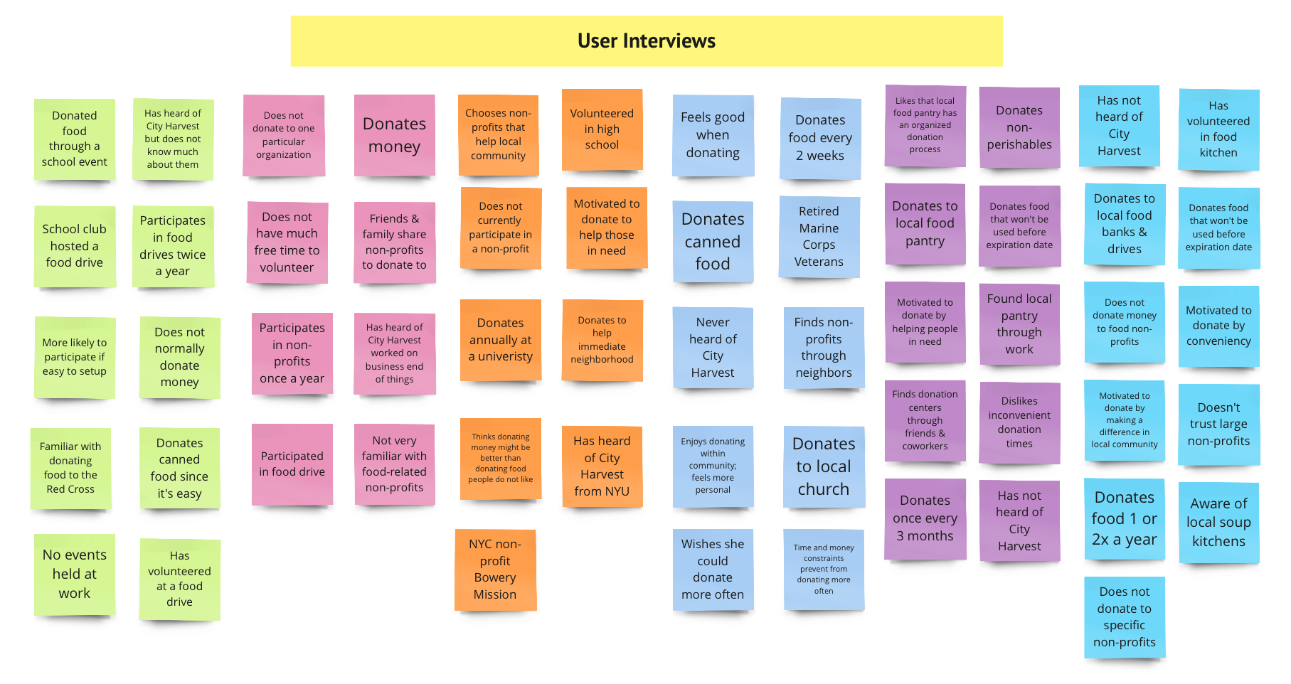
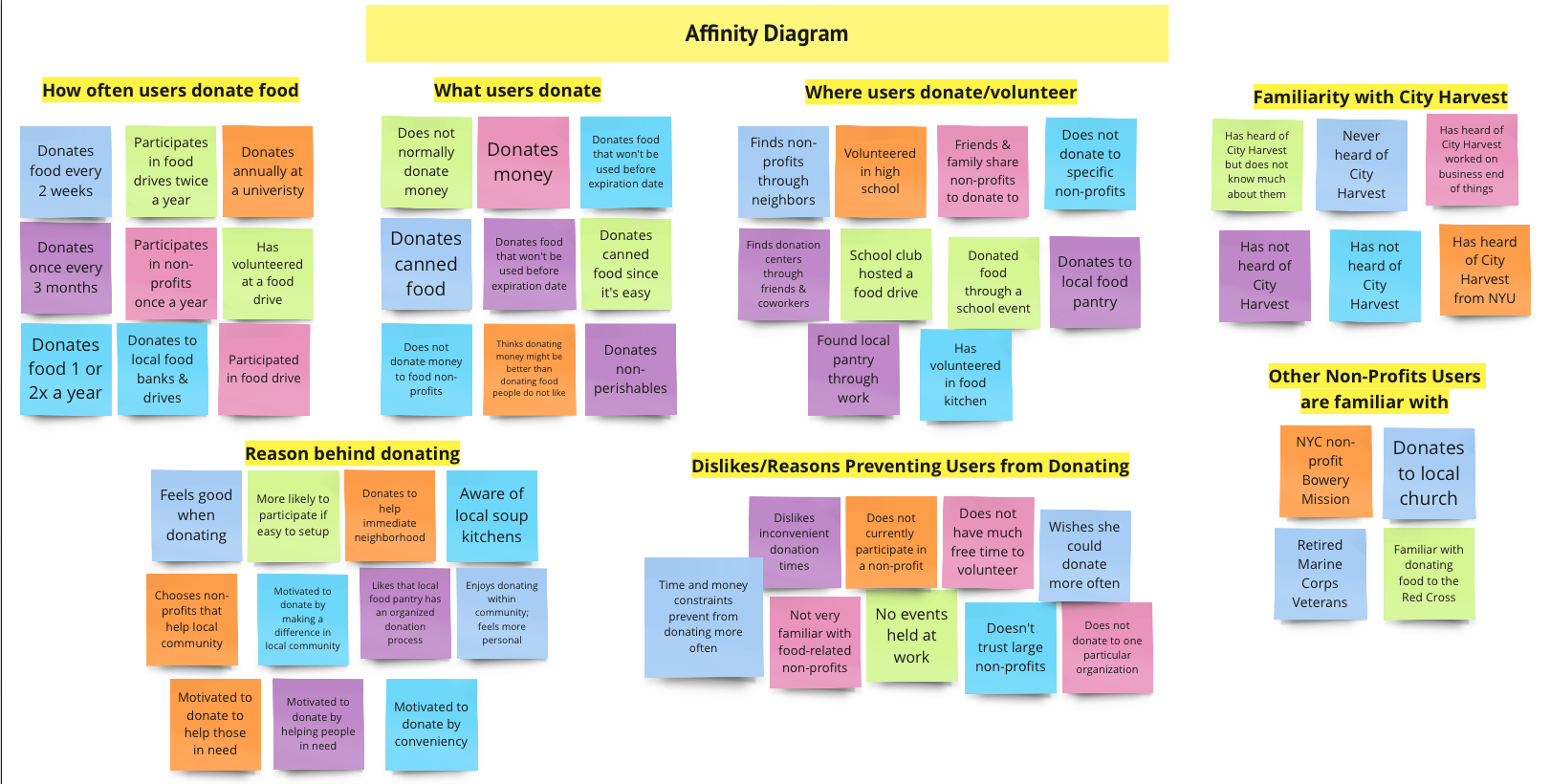
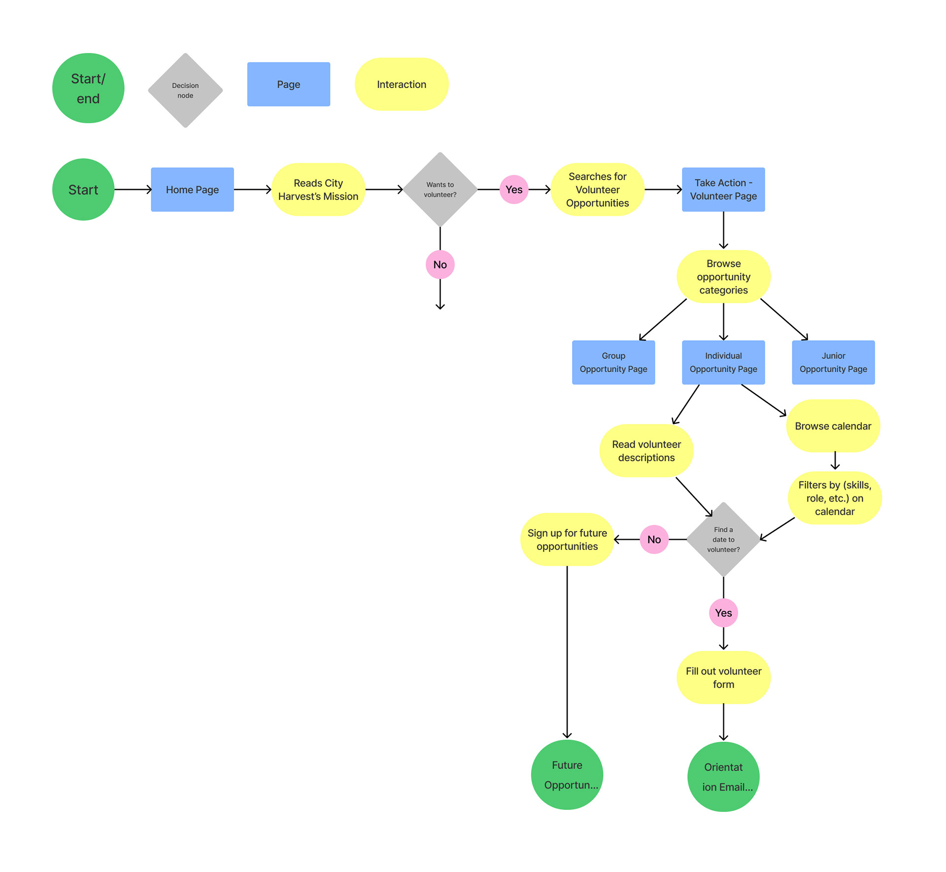
We made significant changes to our website version: Based on our user interviews, we found out Mission Statement is not clear. The user felt Difficulty Navigating through the website and the Volunteer flow are not straightforward.
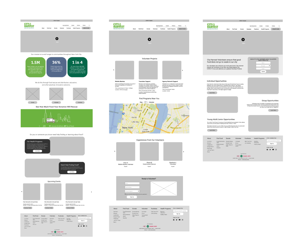
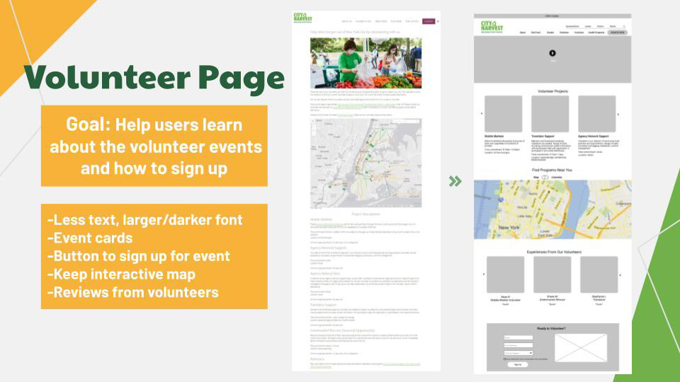
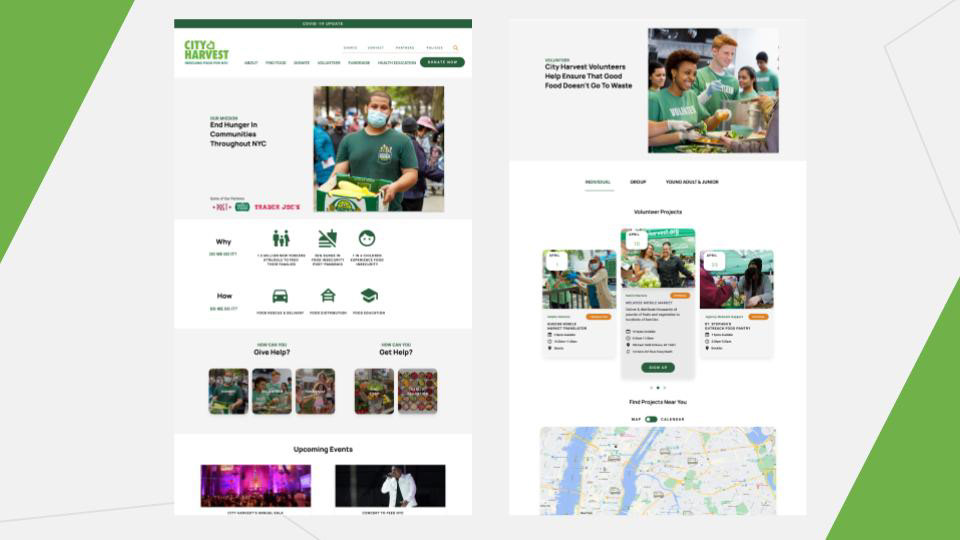
Low Fidelity Prototype
Goal: Help users understand the mission of City Harvest, what they do, and how they can get involved
1. Simplify wording on the nav bar
2. Clear mission statement
3. Attention-grabbing statistics
4. Redesign buttons
1. Simplify wording on the nav bar
2. Clear mission statement
3. Attention-grabbing statistics
4. Redesign buttons